Global Payments • UX Enhancement • Leadership • Prototype
Reimagining the Restaurant
Checkout Experience
“Tips Were Dropping... eeeek!”
So We Redesigned the Moment That Matters
Due to Non-Disclosure Agreements, specific details and visuals from this project are omitted to maintain confidentiality.
Business Goal
Global Payments aimed to improve the tipping experience in Genius by reducing drop-offs during checkout. Customers often walked away mid-flow, leading to lost tips and reviews. The redesigned display focused on speed, clarity, and keeping users engaged through the full transaction.
My Plan
Create a frictionless journey, encouraging users to complete the flow and leave a tip.
My Role
Lead Designer
As the lead designer for the customer display redesign, I owned the end-to-end design process, collaborated across teams, and drove strategic decisions shaping the product experience from concept to delivery.
Team Delegation
Managed weekly design timelines and assigned tasks based on team strengths.
Design Ownership
Led visual and UX direction of the POS flow, ensuring clarity, consistency, and responsiveness across the new 13" customer-facing screen.
Cross-Functional Communication
Collaborated with PMs, engineers, and dealers to validate design decisions and ensure solutions were both feasible and built to stick.
Execution Oversight
Delivered high-fidelity prototypes and partnered with engineers for accurate implementation.
The Problem
Before the Glow Up
“The original flow displayed only one screen at a time, causing confusion about what came next.”
Identifying Drop-Off Triggers and Opportunity Areas
Missed Revenue Opportunities
Since tipping and reviews weren't surfaced upfront, users often skipped them altogether, leading to fewer completed interactions and reduced tip volume.

Mismatched Button Priority
The call-to-action lacked proper hierarchy. Button styling unintentionally signaled finality rather than guiding continuation, causing confusion.
Confusion meant Drop-offs
The screen advanced only after a user tapped, with no indicators that more steps would follow, causing customers to believe the interaction was complete after the first screen.
Research Phase
Research & Analysis
Research and analysis under NDA
Competitive Analysis
Researched leading restaurant POS platforms to benchmark UX patterns, pricing structures, and feature gaps.
Customer Journey Mapping
Mapped the end-to-end checkout flow, including loyalty sign-in, tip, signature, and rate service steps, to highlight drop-off points and identify friction across each stage.
Insight Synthesis
Consolidated qualitative and quantitative data into digestible insights to guide design priorities, wireframes, and product direction.
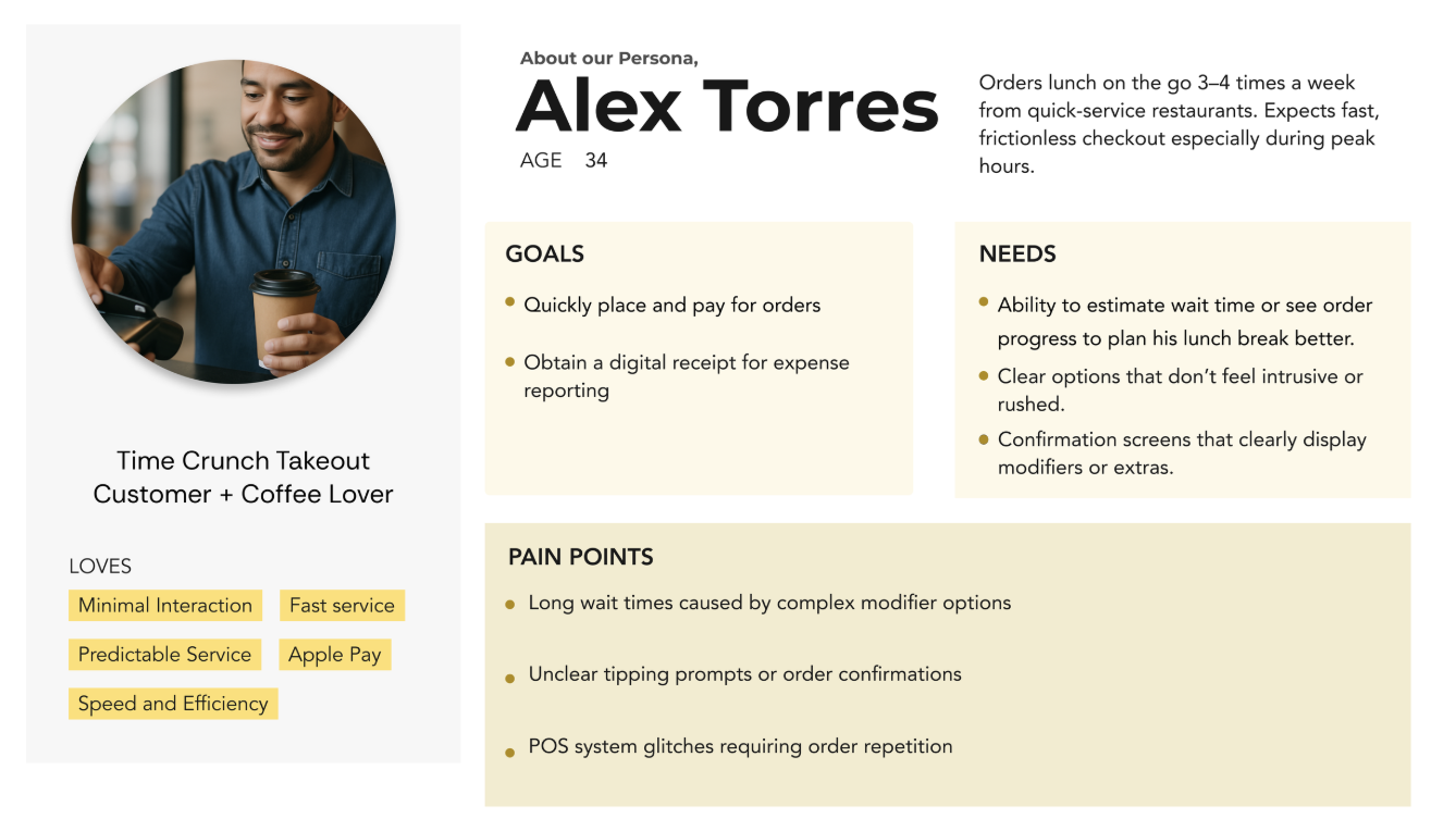
Leveraging Internal Insights
During this phase, we referenced our main target audience, drawn from client feedback, internal team knowledge, and industry context. This helped us validate key needs and behaviors without requiring new interviews.
My Process
Team Structuring & Delegation▾
To meet our tight four-week timeline, I focused on:
- Organizing the design workflow based on team strengths.
- Delegating the lower-risk login flow to a junior designer, while a fellow senior designer and I focused on the overall UX and branding.
Design Ownership▾
- I led the end-to-end design and prototyping of the core customer-facing flow, while my teammate contributed to brand alignment, visuals, and UX refinement.
Cross Functional Collaboration▾
- I helped plan and lead recurring syncs with PMs to gather and clarify requirements and product feedback
- This allowed us to quickly align on priorities and iterate with speed and intention
Strategic Adjustments▾
- I made sure we were all utilizing our time intentionally
- Midway through the sprint, I proposed shifting from twice-weekly meetings to weekly check-ins with PMs.
- This gave the design team more heads-down time while maintaining alignment and momentum.
- Midway through the sprint, I proposed shifting from twice-weekly meetings to weekly check-ins with PMs.
Measuring Success
How I Defined, Tested & Tracked It
Before design even started, I proposed a set of success metrics to the PM and we aligned on what “better” actually meant, so we weren't shipping on gut feeling. Metrics were defined upfront, tested during prototype reviews, and validated post-launch through internal analytics.
What I Chose to Track
I identified three core signals that would tell us if the redesign was working. I chose them because they mapped directly to the business problem (tip drop-off), not just design quality. I presented these to the PM and we agreed this was the right approach.
- ·Tip Completion Rate: % of customers who reached the tip screen and selected an amount
- ·Checkout Flow Completion Rate: % of transactions that reached the final confirmation screen without abandonment
- ·Review Submission Rate: % of customers who engaged with the post-payment review prompt
How I Validated Before Launch
With no access to live users, I drove validation through internal walkthroughs and prototype reviews. I structured these sessions to surface friction before it hit production and presented findings back to the PM for sign-off.
- ·Prototype Walkthroughs: I facilitated sessions where stakeholders and the PM stepped through the flow to flag confusion points and timing issues
- ·Screen Timing Reviews: I reviewed how long each screen was visible and whether key actions (tip, review) were surfaced at the right moment
- ·Heuristic Evaluation: I assessed each screen against usability principles: clarity, visibility of system status, and error prevention
How It Determined the Outcome
Post-launch data was reviewed internally. I tracked the signals I had defined and shared a summary with the PM. Success wasn't a single number; it was a pattern across all three signals moving in the same direction.
- ·Tip Completion up: Surfacing the tip screen earlier and with clearer hierarchy led to more customers completing the step
- ·Fewer Drop-offs: Improved progress cues reduced premature exits so customers understood more steps were coming
- ·Review Engagement up: Placing the review prompt post-confirmation rather than mid-flow improved submission rates
Specific figures are omitted under NDA.
- ·I strengthened my ability to delegate tasks and lead cross-functional efforts across design and product.
- ·I improved how I collaborate with product managers, creating clarity on goals and alignment across verticals.
- ·I developed more confidence in making fast, informed decisions, even without formal user interviews, by leaning into internal insights and customer-facing teams.
- ·I saw how small UX decisions, like modifier placement or tipping flow, can have a big impact on real-world merchant efficiency.
- ·I learned to prioritize user value and feasibility under time constraints, making tradeoffs without compromising on core experience.
- ·I would advocate for earlier usability testing to validate flow assumptions and catch edge cases.
- ·I'd bring engineers into ideation sooner to surface technical constraints before design handoff.
- ·I'd set clearer expectations around multi-department handoffs to minimize back-and-forth in execution phases.
The Prototype