Project Untaboo• Health & Wellness • Mobile • UI Design
Period Care,
Wherever You Are
Designing the first iteration of a community-driven mobile app that makes period care accessible for travelers - no matter where they are.
6-week sprint · UX/UI Design
Role
UX/UI Designer
Company
Project Untaboo
Duration
6 Weeks
Scope
First UX Iteration · MVP
The Project
A Community That Has Your Back
Project Untaboo is a mobile app designed around a simple but powerful idea: when you're traveling and need period care products, someone nearby can help. The app connects users to a growing community of people willing to share, making period care convenient and stress-free on the go.
My team was responsible for designing the first iteration of UX deliverables - building the product from scratch in six weeks, from research and ideation to high-fidelity screens and a clickable prototype.
Credits: Design team, Engineering, Founder/CEO
The Problem
What We Were Solving
“Travelers struggle to find reliable, convenient period care products while on the move - despite it being a widespread, everyday need.”
Goals
Business Goal
Launch an MVP mobile app that maximizes user convenience and support - enabling users to effortlessly request period care products from people nearby, while building a trustworthy, personable community experience that keeps users coming back.
Strategy
My Plan
Ground every design decision in user feedback. Run a cross-functional ideation workshop to align the team early, then test quickly and iterate fast - keeping the experience straightforward, personable, and safe-feeling.
- ·Lead a 6-8-5 brainstorming workshop with designers, engineers, and leadership
- ·Conduct usability testing with 6 real users across key flows
- ·Iterate on product selection, time scheduling, and brand identity
- ·Deliver high-fidelity screens and a clickable prototype
Research
Listening First
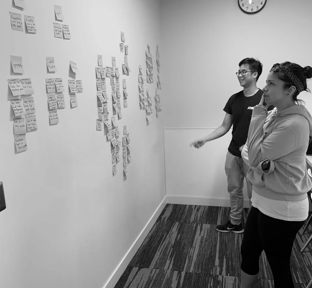
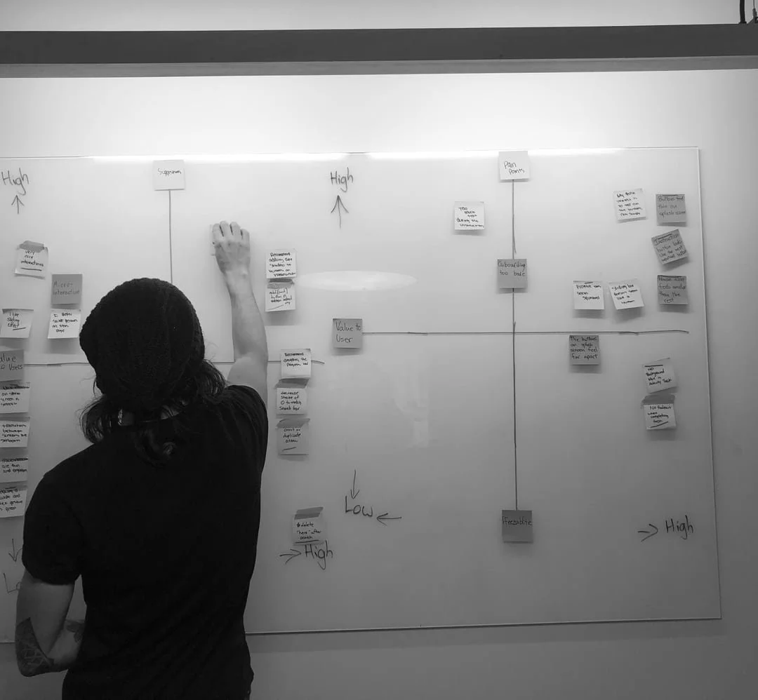
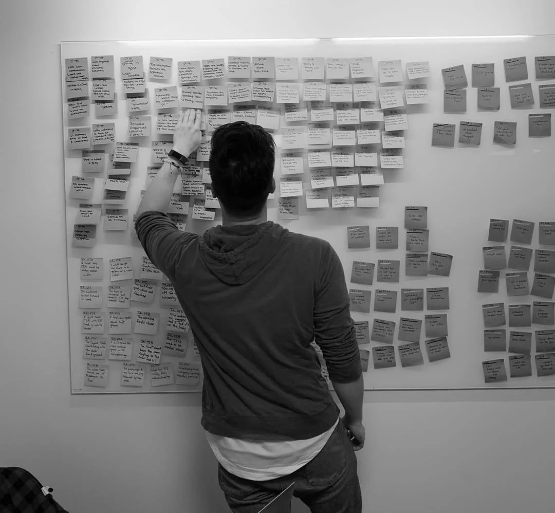
We ran usability testing with 6 users and affinity-mapped the findings to surface patterns and prioritize what mattered most for the MVP.
Research Insights
Pain Points We Uncovered
Product Selection
- ·Insufficient direction on which products to choose
- ·Limited options and inadequate imagery
- ·5 users requested more variety; 4 noted colors felt dated
- ·All 6 testers recommended color adjustments for legibility
Time Selection
- ·Too many selection options created decision fatigue
- ·Confusing interface with accessibility concerns around brand colors
- ·4 users wanted faster selection via quick-pick buttons
- ·3 found the instructional copy unclear
Brand Disconnect
- ·Colors and fonts created an unintended vintage aesthetic
- ·Visual identity felt misaligned with the company's modern, inclusive vision
- ·Required collaboration with the founder/CEO to course-correct
Ideation
6-8-5 Workshop
I facilitated a cross-functional brainstorming session with the design team, engineers, and leadership - generating ideas fast and building on each other's thinking through rapid sketching rounds.
- →Users needed product search and help access from the home screen
- →A period tracker feature was desired but secondary to core functionality
- →Community support was considered a core differentiator
- →Simple, to-the-point design was the clear preference
Iteration
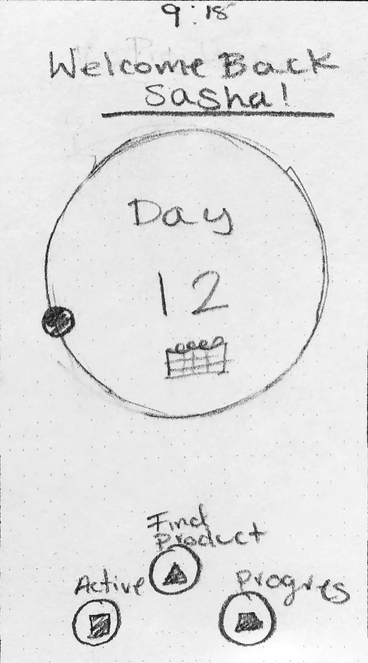
Getting the Home Screen Right
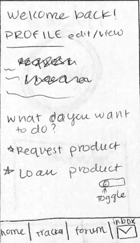
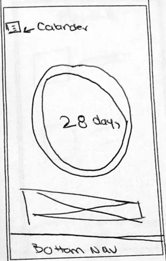
Initial testing revealed three problems with our first home screen design. The period tracker dominated the page, confused users about the app's primary purpose, and the button hierarchy buried the most important action.
- 1Period tracker prominence confused the app's main purpose
- 2Heavy single-color usage created visual fatigue
- 3Primary function buttons lacked sufficient contrast and hierarchy
The Solution
Designing for Clarity & Community
Every decision came back to three things users told us they wanted: an app that's straightforward and to the point, a personable experience, and a social environment that makes them feel safe.
Product Selection - Redesigned
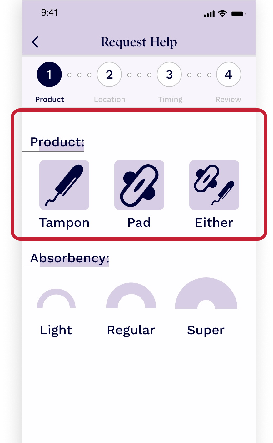
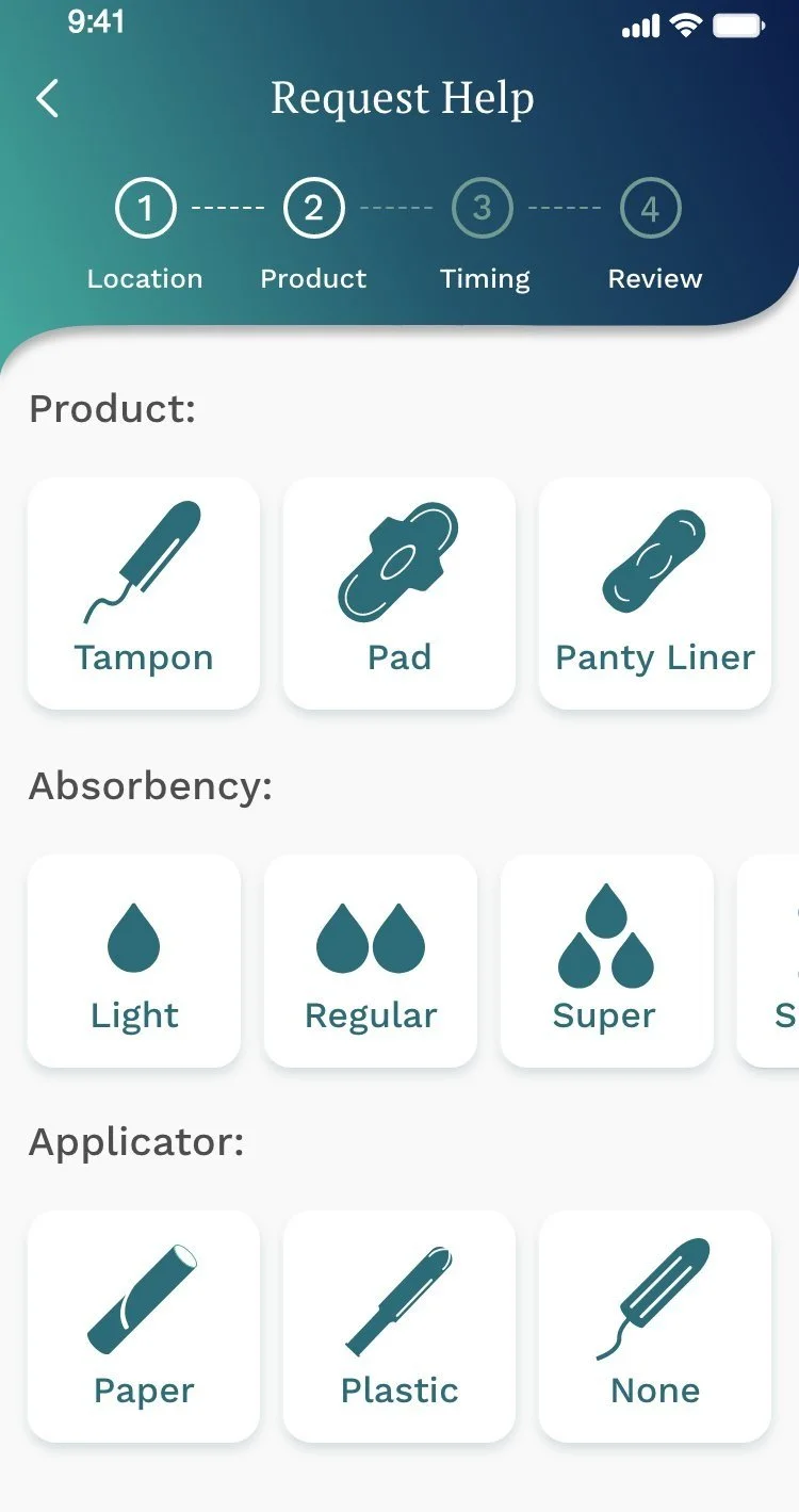
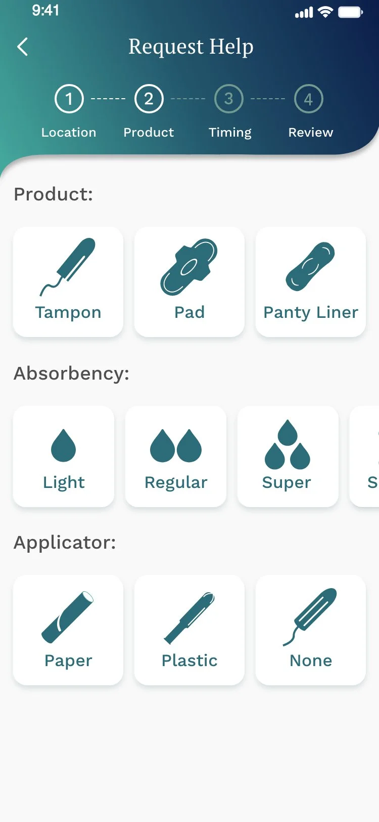
Expanded product options to include Tampons, Pads, and Panty Liners, with absorbency levels (Light, Regular, Super) and applicator types (Paper, Plastic, None). Clear iconography replaced the dated visual language, and colors were updated based directly on user feedback.
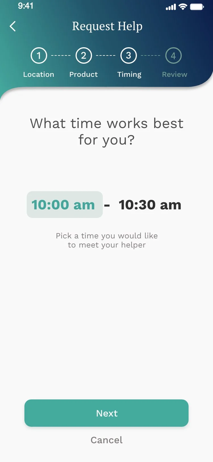
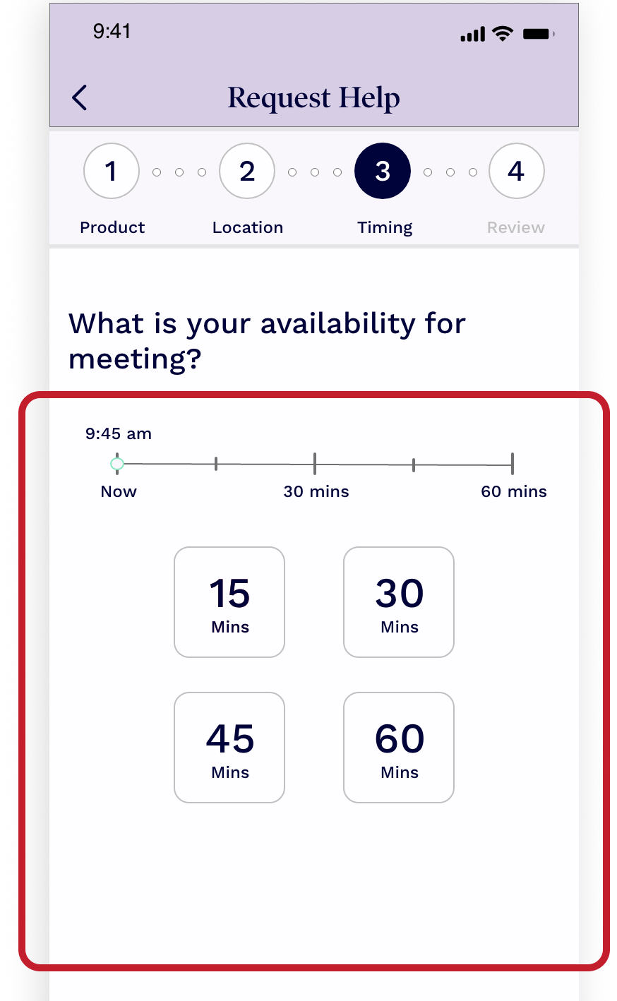
Time Selection - Simplified
Replaced the overloaded picker with a clean native time range selector users already understand. Simplified the instructional copy to a single clear question - “What time works best for you?” - and added a prominent Next button to move the flow forward without confusion.
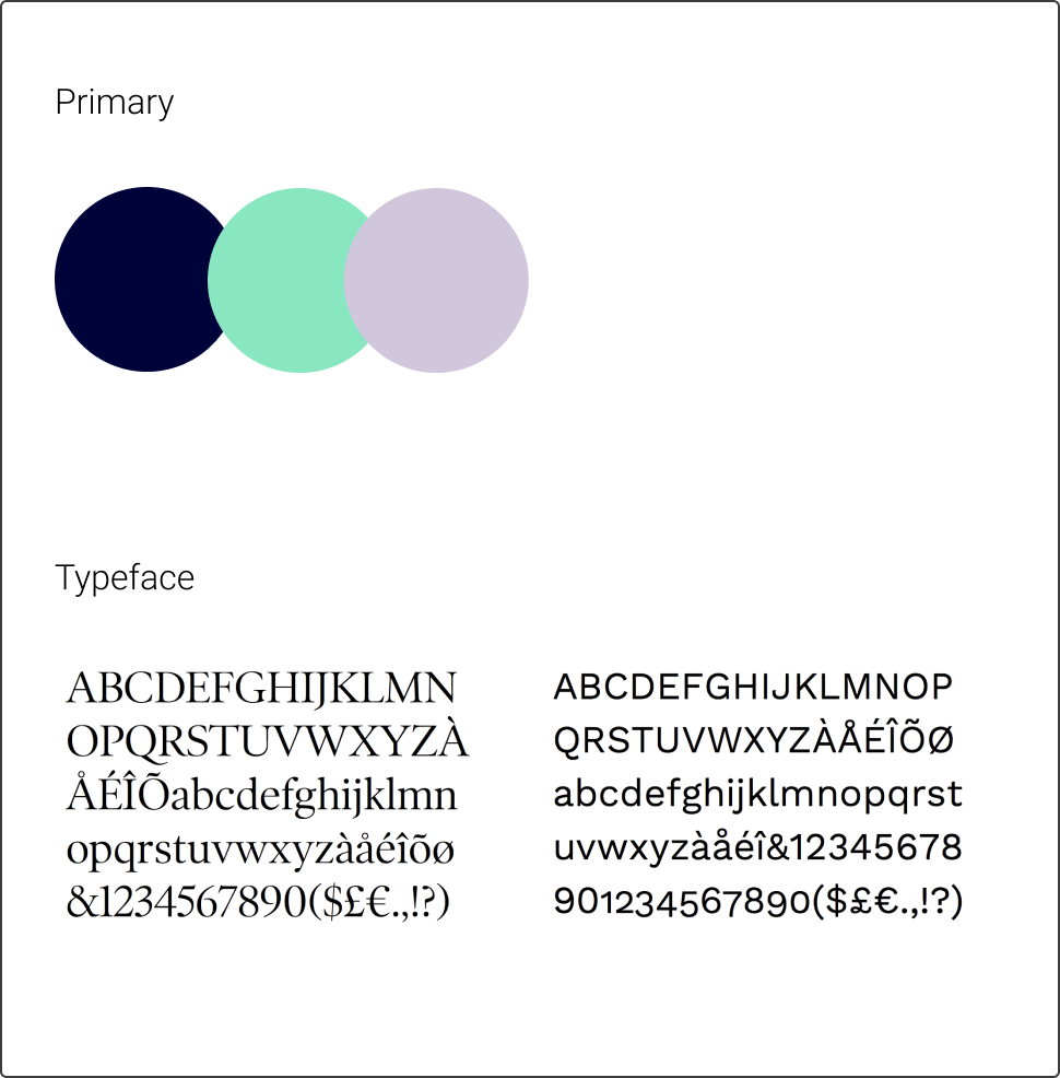
Brand Identity - Refined
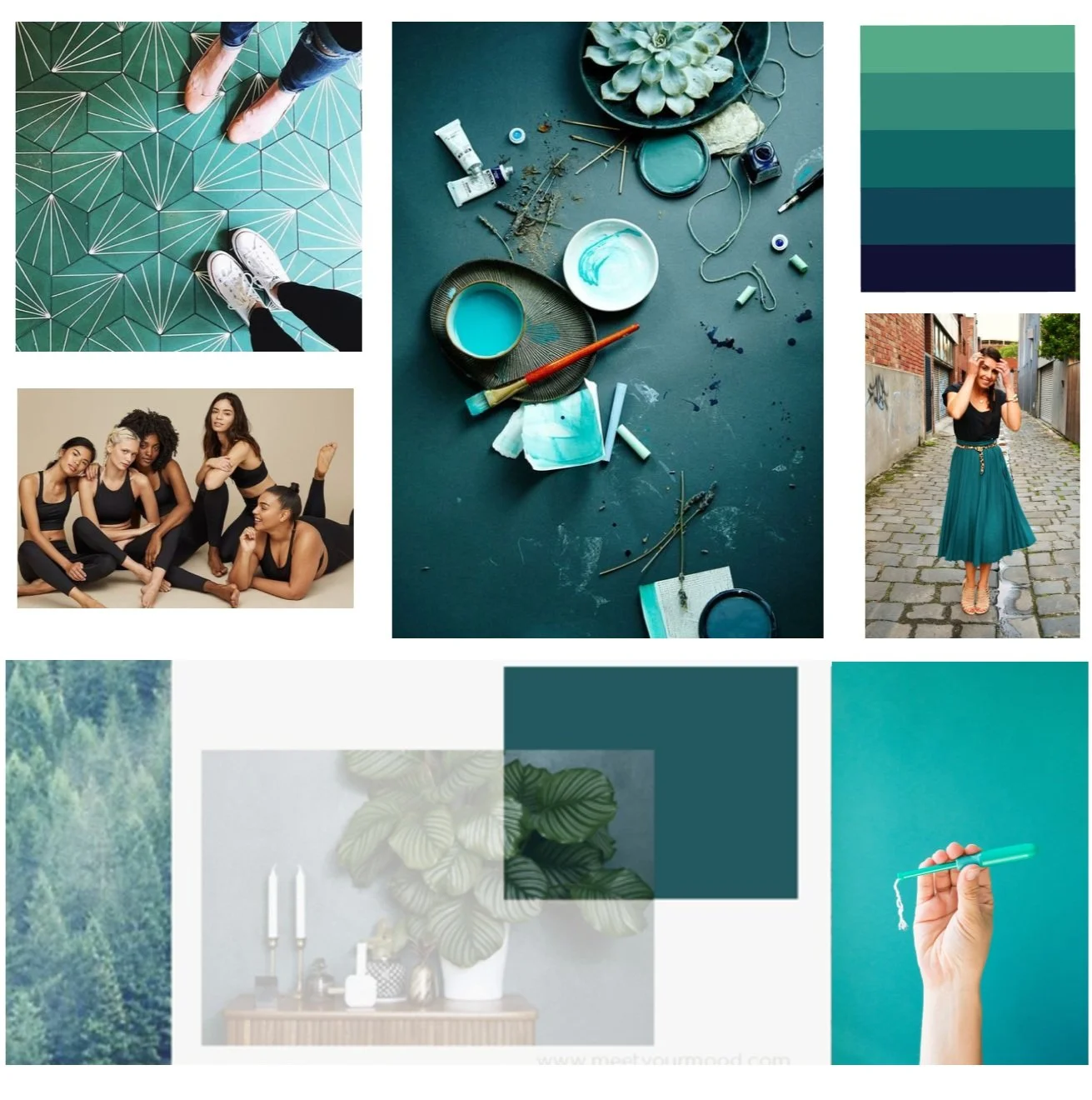
Worked directly with the founder/CEO to refine (not replace) the color palette. Created a mood board to align the team around a modern, inclusive visual direction - teal as the primary color, with a cleaner typographic system. Small adjustments, big shift in perception.
Home Screen
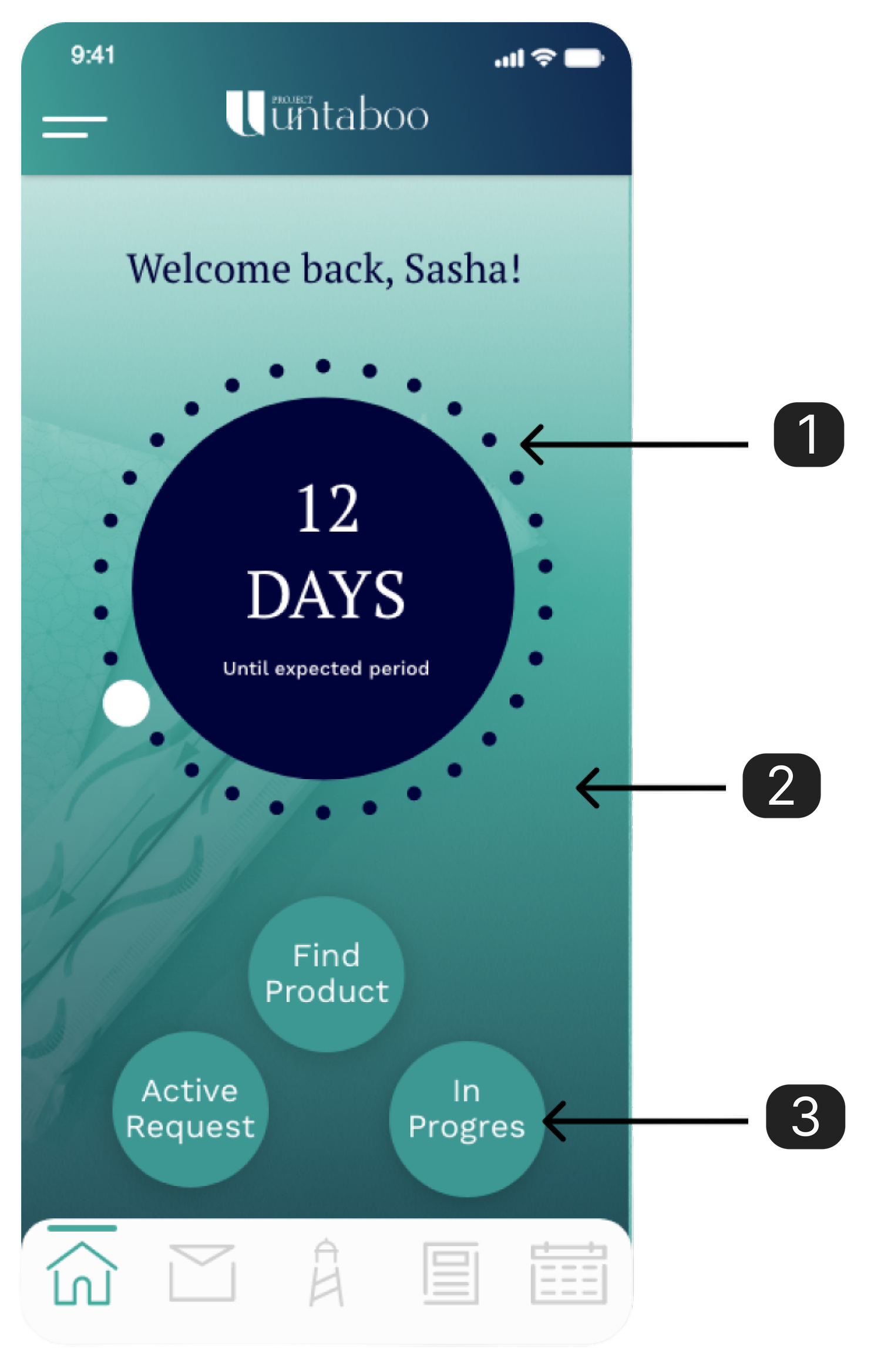
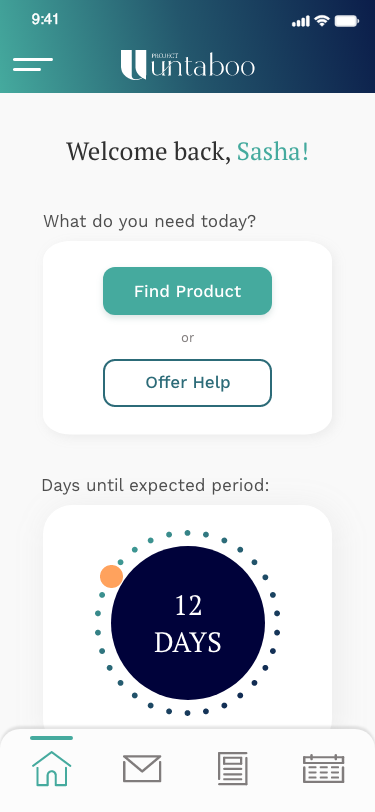
One Clear Question
The redesigned home screen leads with a single, direct question: “What do you need today?” The primary CTA - Find Product - is immediately visible. The period tracker is still there, but supporting, not dominating.
- ·Find Product promoted to primary CTA
- ·Offer Help as a clear secondary action
- ·Period tracker moved below the fold
- ·Reduced color usage for a cleaner, more breathable layout
Key Screens
The Core Flow
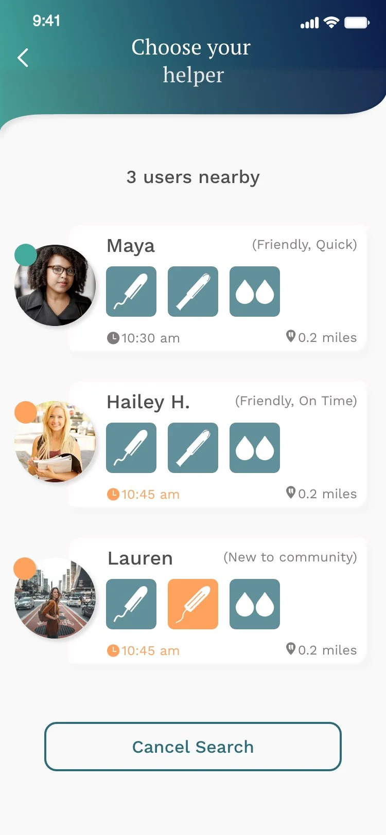
Choose Your Helper
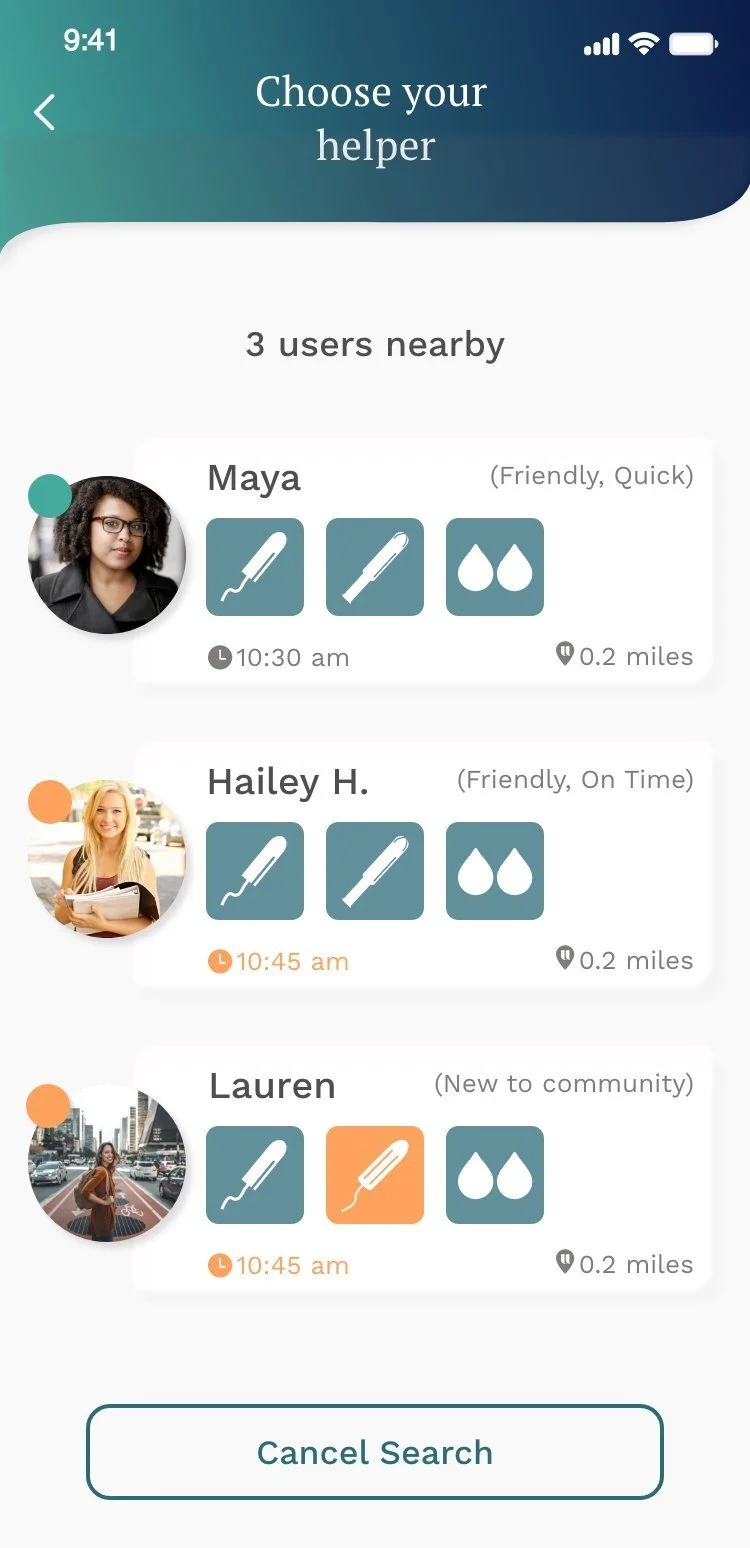
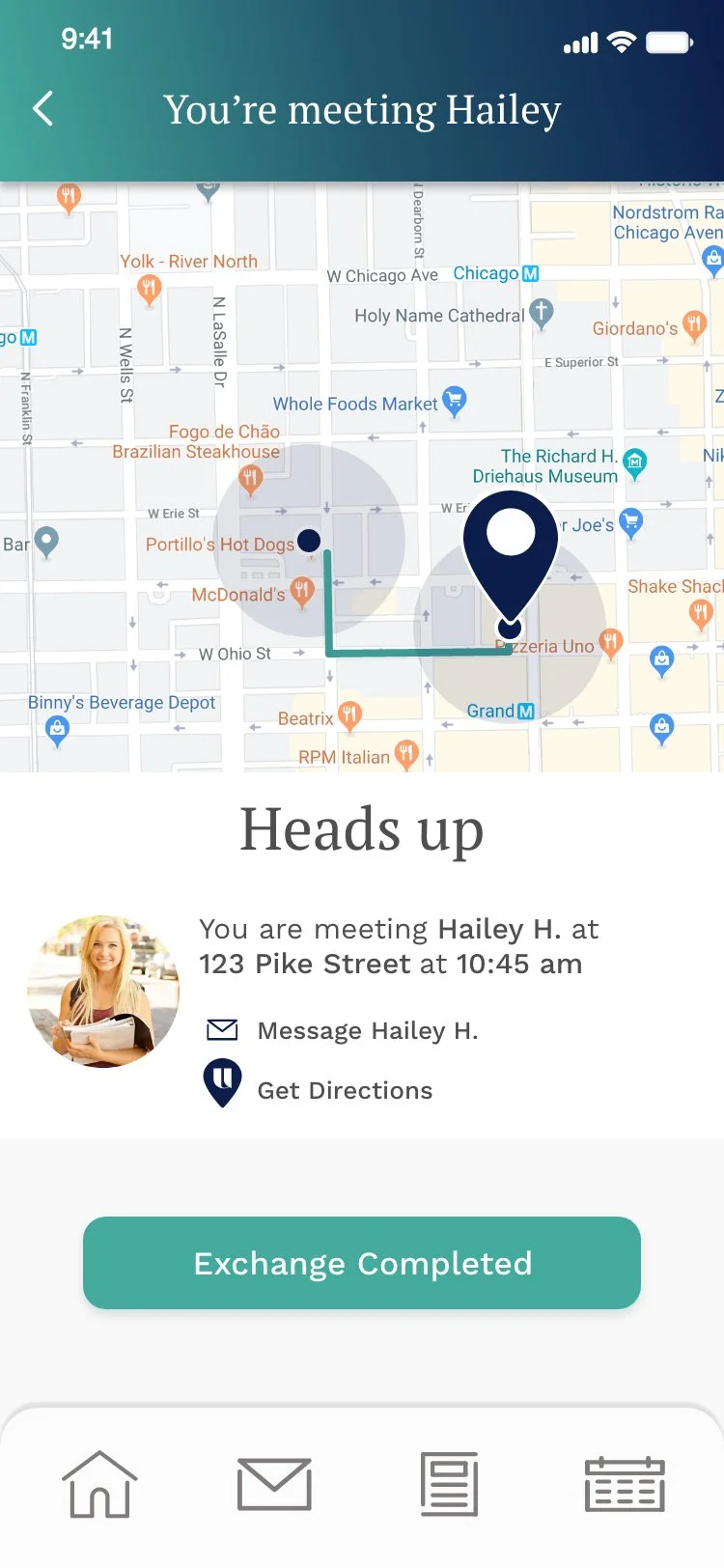
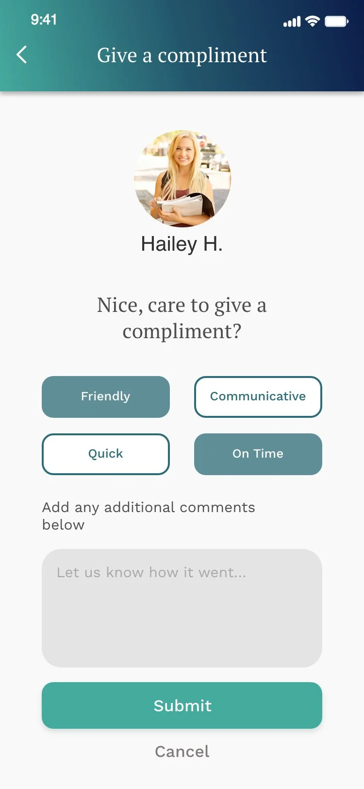
Users see nearby helpers with their available products, timing, and distance - building trust through transparency and community ratings.
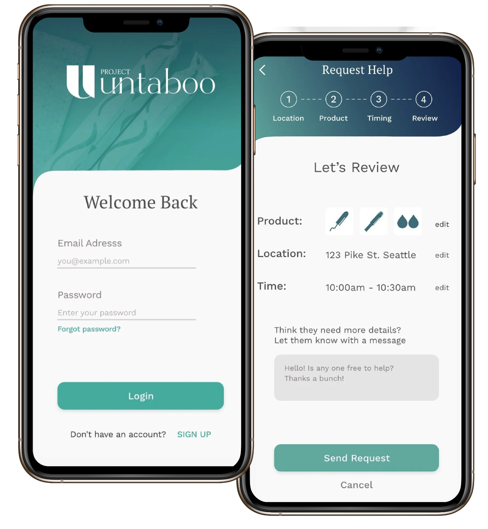
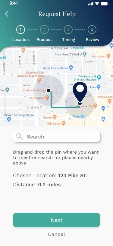
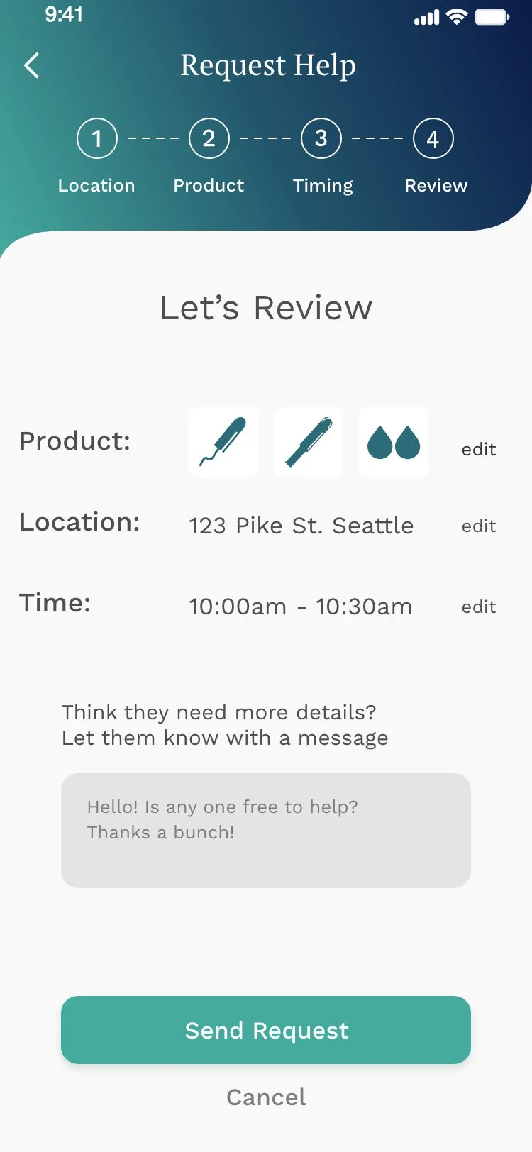
Request Help

A 4-step request flow - Location, Product, Timing, Review - guides users through a clear, structured process with no ambiguity at each step.
The Screens
Final Designs

- ·Strengthened my ability to run collaborative workshops with cross-functional teams including engineers and leadership.
- ·Gained experience balancing founder vision with user feedback, knowing when to refine vs. replace.
- ·Developed confidence in facilitating early-stage design decisions under tight timelines.
- ·Testing early and often delivers unbiased feedback that changes the product for the better.
- ·Collaborating with engineers from the start ensures feasibility and accelerates development.
- ·Small details in an MVP - copy, color, hierarchy - are often the difference between clarity and confusion.
- ·Establish brand guardrails with the founder before any visual design begins.
- ·Run a dedicated accessibility audit earlier to catch color and contrast issues in the first round.
- ·Create a lightweight component library from the start to ensure consistency across screens.