Tagboard • Redesign • B2B SaaS • End-to-End
Production DashboardRedesign · 2022
End-to-end redesign of the Production Management Dashboard, enhancing information architecture and streamlining the live broadcast workflow.
Due to Non-Disclosure Agreements, specific details and visuals from this project are omitted to maintain confidentiality.
Context
The Project
Role
Lead Product Designer
Company
Tagboard
Year
2022
Scope
End-to-End
Tagboard's Production Dashboard is the nerve center for live content producers: the tool they use to manage, schedule, and push graphics to screen during broadcasts. As the product scaled, the dashboard had accumulated years of features without a unifying structure, leaving producers navigating a cluttered interface under the pressure of live production.
I led the end-to-end redesign, from initial discovery and user research through final design handoff. The goal was to restructure the information architecture and rebuild the interface so that it reflected how producers actually work, not just how features had been bolted on over time.
Credits: Engineering team, Product Manager Jenny Yang, VP of Product and Strategy Christine Chalk, and the Tagboard producer community whose feedback shaped every iteration.
The Problem
What We Were Solving
“Producers are losing valuable seconds during live broadcasts navigating a dashboard that wasn't designed with their workflow in mind. We need to fix this before we lose them to competitors.”
Process: Step 01
Audit & Discovery
Conducted a full audit of the existing dashboard, cataloging every component, interaction, and screen state. Paired with stakeholder interviews and session recordings to map where producers were losing time and where critical information was buried.
- →Full component & interaction inventory
- →Stakeholder interviews across teams
- →Session recording analysis
- →Pain point mapping
Process: Step 02
User Interviews & Personas
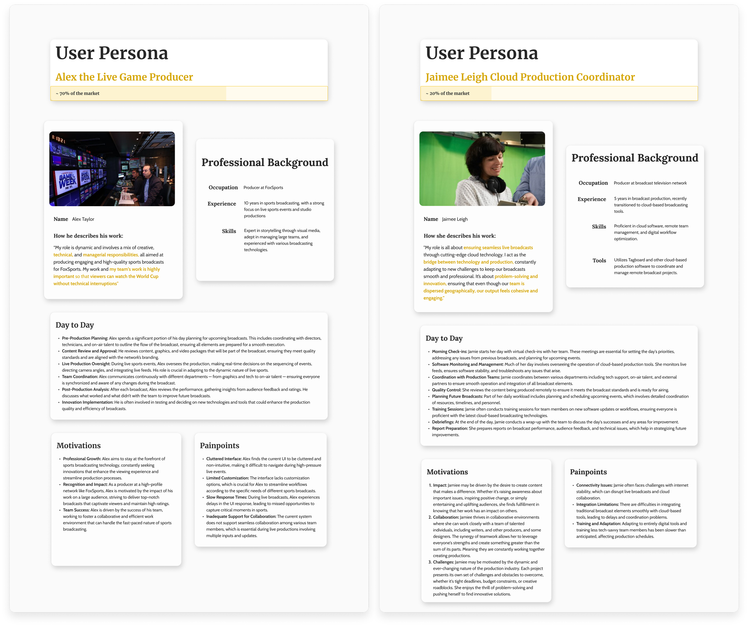
Sat with live production teams to observe their real workflows. Discovered that producers were context-switching between multiple panels constantly, and that the most-used controls were the least accessible.
These sessions directly shaped the new information hierarchy, and exposed that different producer types had meaningfully different needs within the same tool.
User Pain Points
From our research, we found 3 key issues with the product that affected the efficiency and overall workflow of our users. The direction of the redesign was a project aimed at enhancing the user experience and operational efficiency for producers.
Issues our users had with our current dashboard:
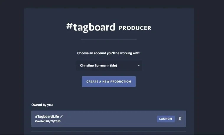
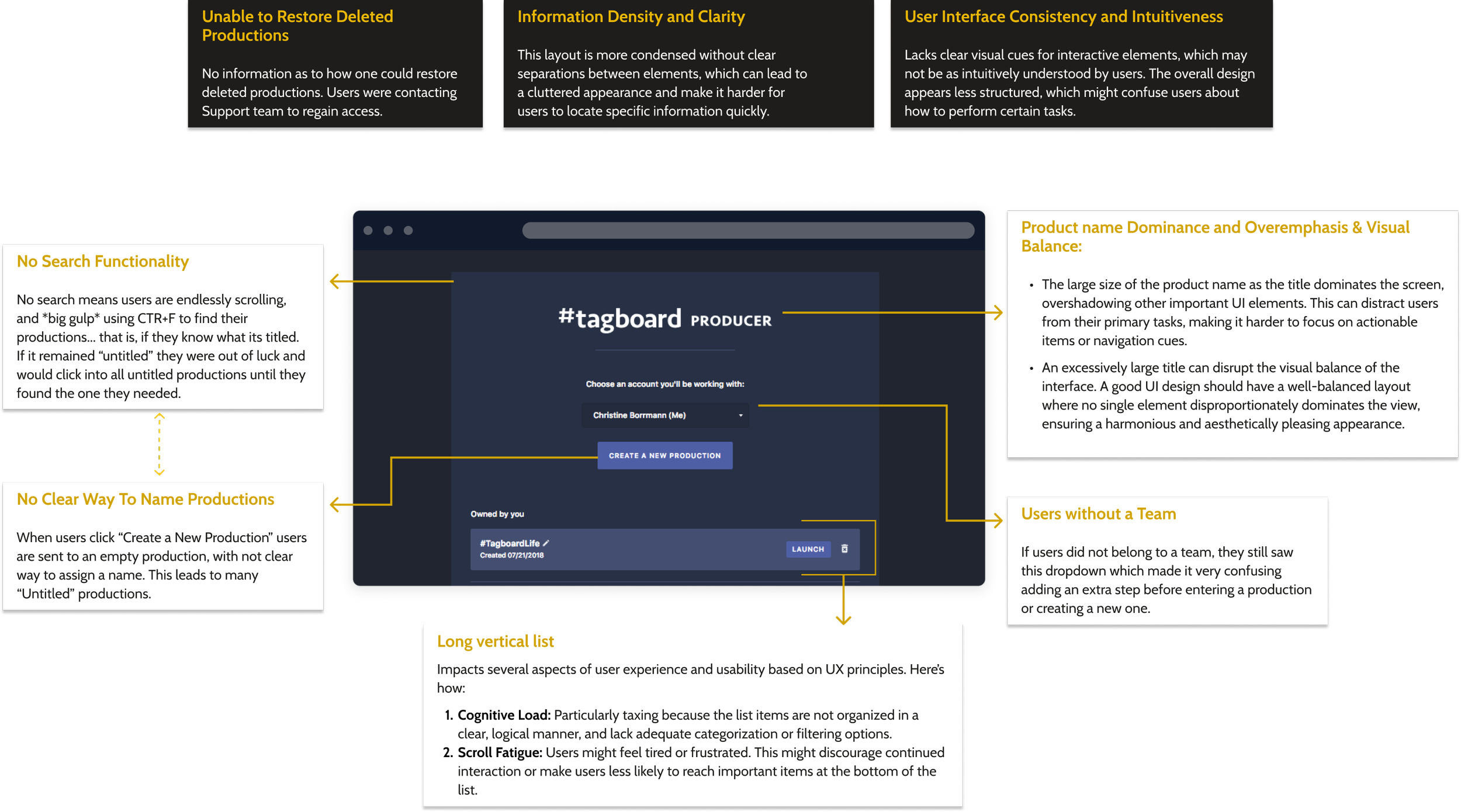
Difficulty Finding Productions
- ·Over 75% of our users used CTRL+F to find a production. A heartbreak, truly.
- ·Many users had “Untitled” productions.
Creating For The Wrong Teams
- ·Users failed to select appropriate team accounts before creating a production.
- ·Users had to contact a member of our Client Success team to help find a production.
- ·After creating a new production, users left their productions untitled.
Inadequate display of information
- ·Users frequently selected the incorrect production due to a lack of sufficient information.
- ·There was poor knowledge of production ownership making it difficult to make edits.
Discovery
Understandingthe users
During this initial discovery phase, we began to formulate questions around their needs and concerns to help us craft the best solutions.
Problem Statements
How might we help our users find a specific production within a long list?
If users do not know or remember their production name, what other information could they use?
How can we decrease user error and keep them from creating productions in the wrong team?
Why are users not naming their productions, and how might we highlight the value of proper naming?
Ideation time!
Mid-Fidelity
To test assumptions I created mid-fi wireframes in order to test the prototype and user interface design.
These mockups were slightly adjusted to respect confidential visuals and information. Have no fear, lo-fidelity mockups were created but unable to share.
The Approach: Information Architecture
Restructuring for How Producers Think
The old dashboard was organized around how the software was built, by feature category. The new structure was organized around how producers work: pre-show setup, live management, and post-show review.
Before
Features grouped by type, all options visible at once, flat undifferentiated hierarchy.
After
Controls grouped by workflow stage, with progressive disclosure, clear primary and secondary actions.
The Solution
New Product Features
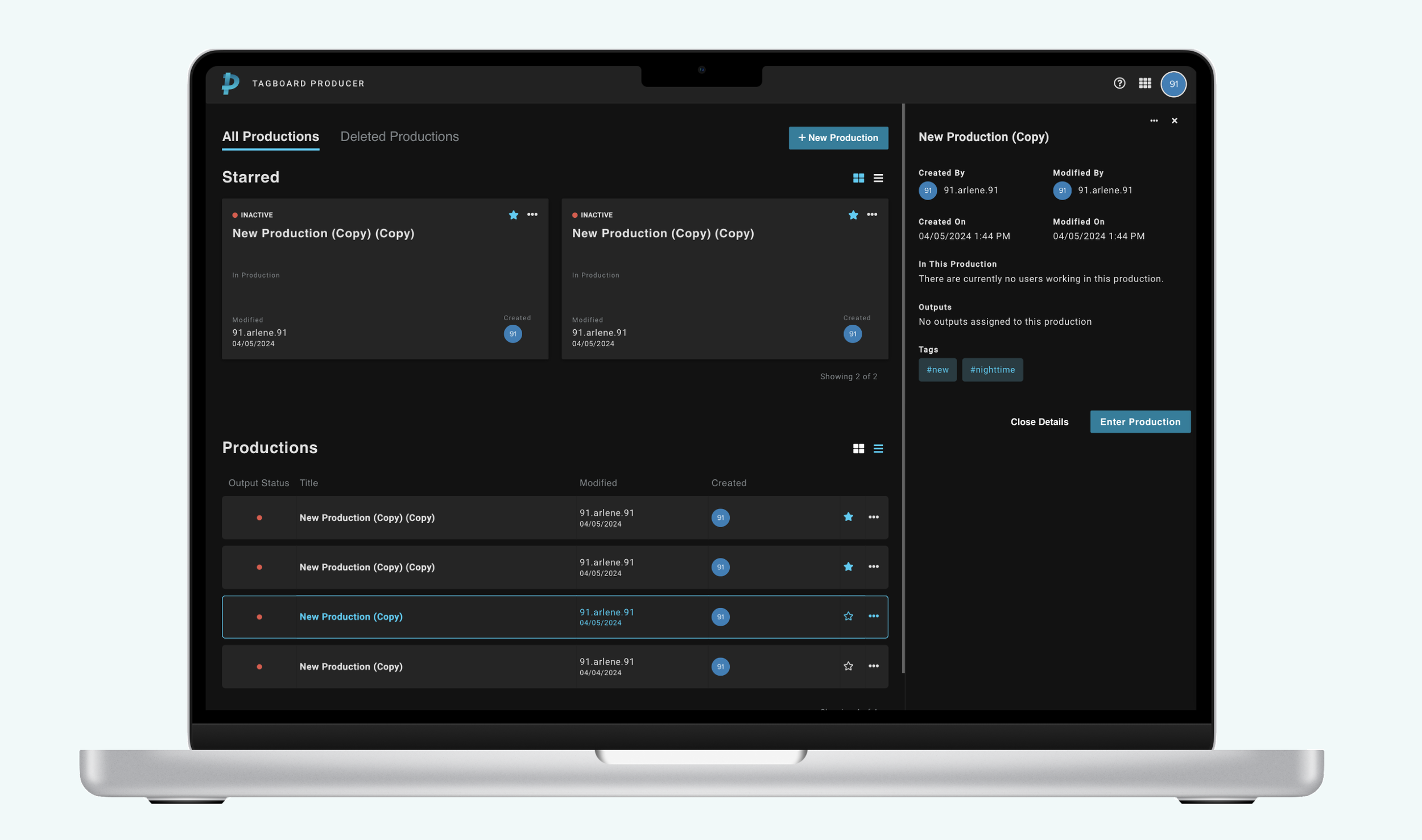
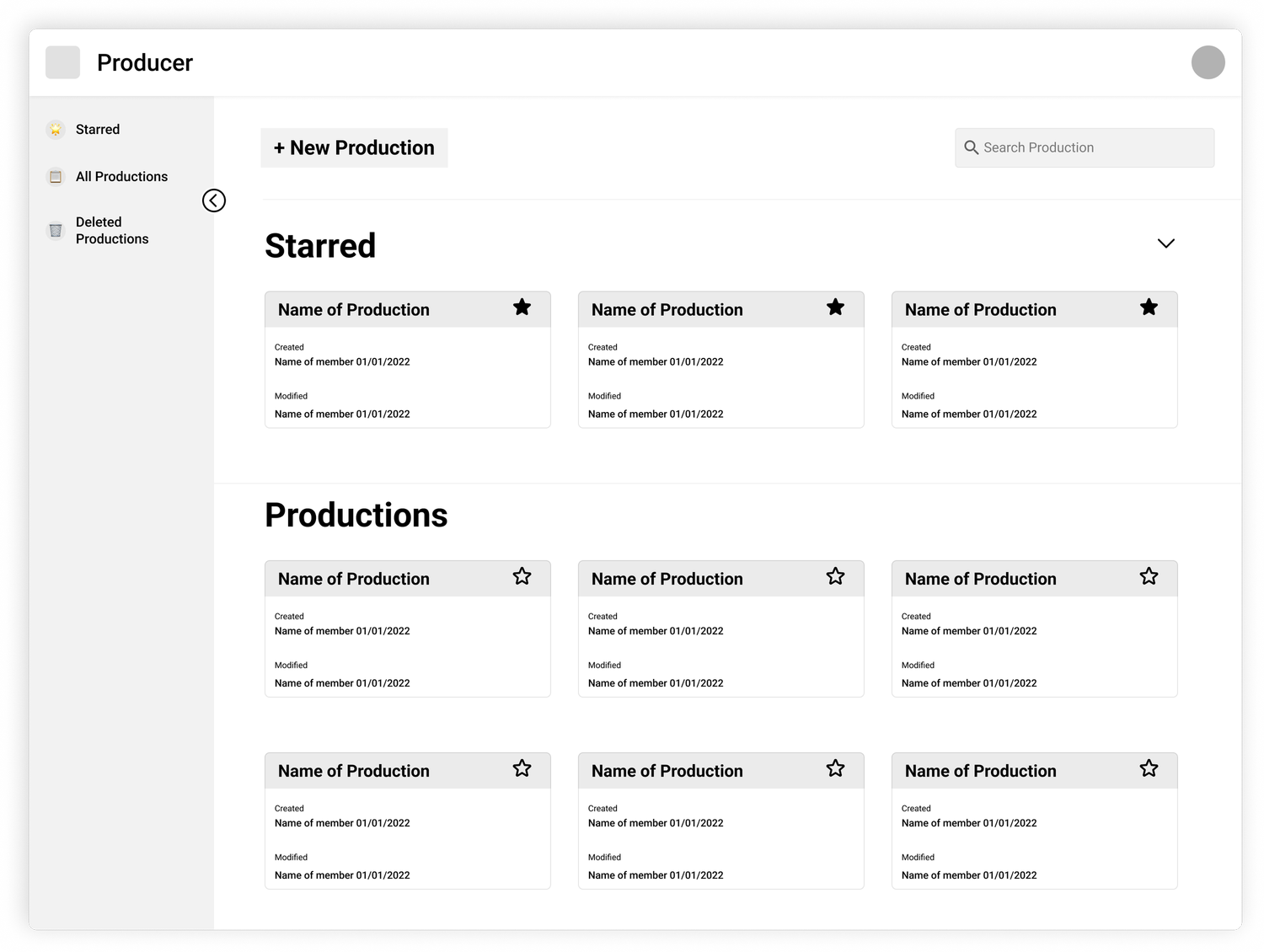
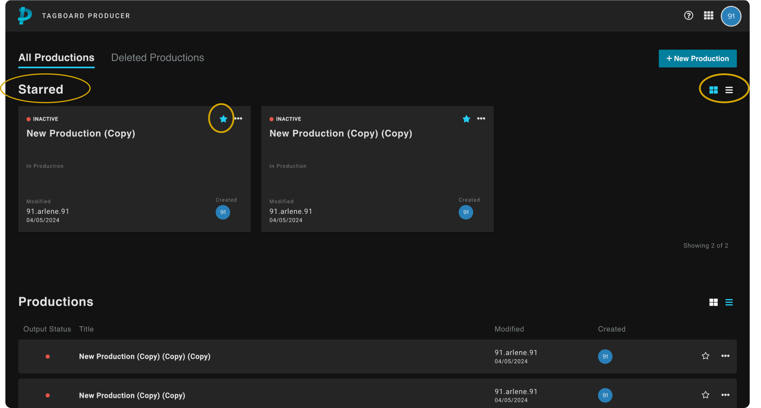
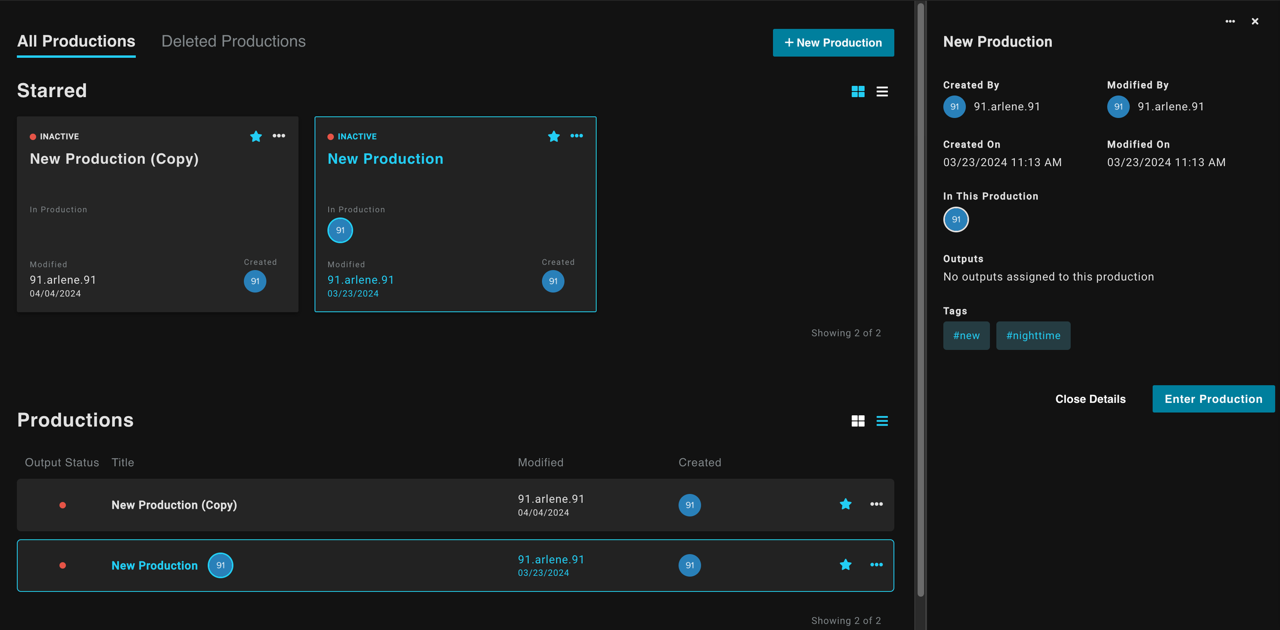
I aimed to make the new dashboard user-centric, card-based interface to allow for easier access to key production details and quick navigation through sorting and filtering.
As a reminder, the user pain points were centered around finding productions, creating productions in the wrong teams, unsure of production ownership.
Pain Point 01
Finding Productions
Over 75% of users were using CTRL+F to locate productions. Many had untitled entries with no way to distinguish one from another.
Pain Point 02
Creating for the Wrong Teams
Users frequently created productions under the wrong team account, requiring Client Success intervention to resolve, adding friction and delay.
Pain Point 03
Production Ownership
Without clear metadata, users couldn't identify who created or last modified a production, making collaboration and editing error-prone.
We solved the previous issues by:
Improving Organization
- →Changing layout to a grid, allowed for easier visual scanning.
- →Introduced double-click functionality to enter production.
- →Introduced a Starred section to help users quickly access their important or frequently used productions.
- →Option to show list view or card view for personal preferences and visual organization.
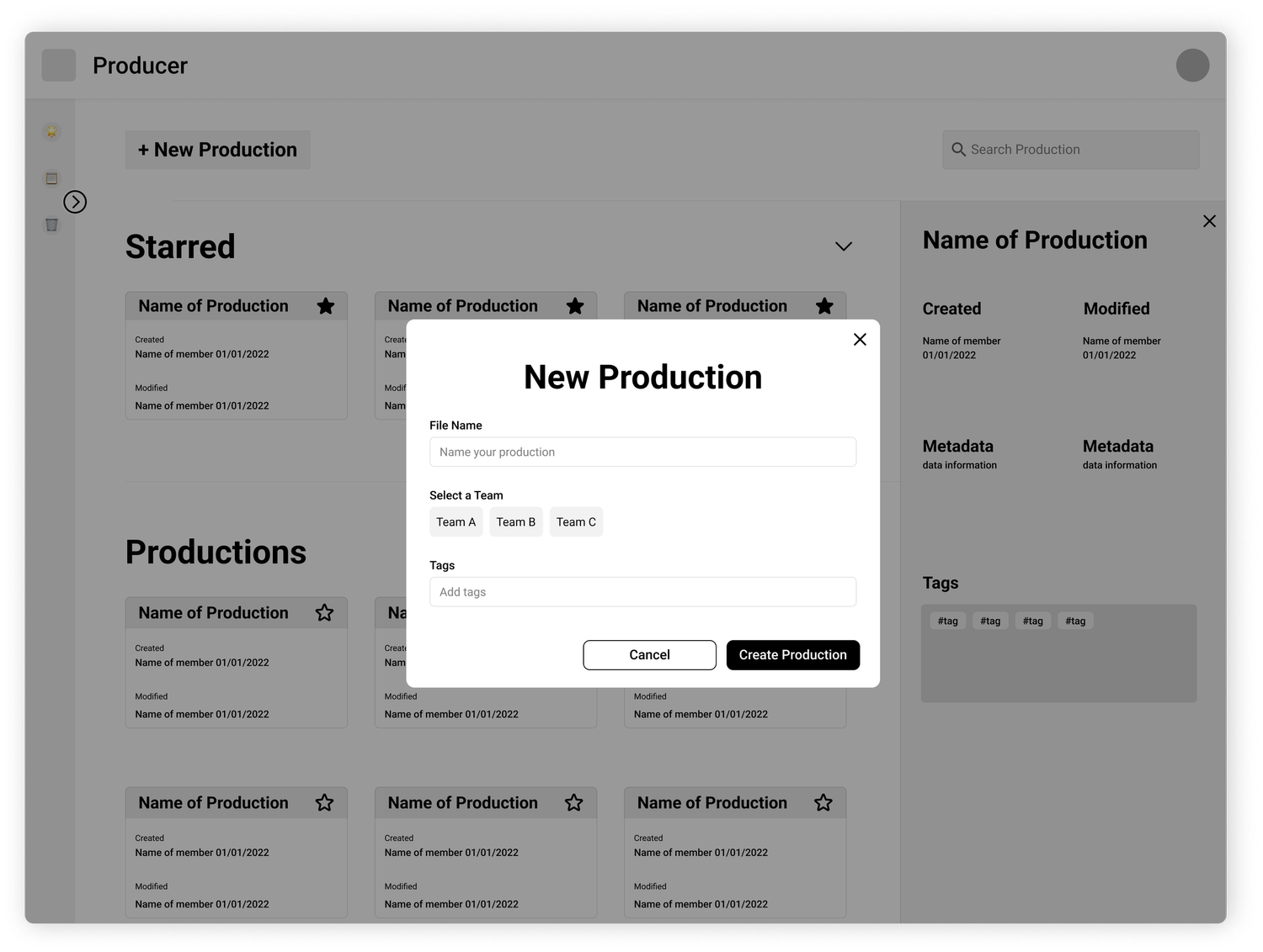
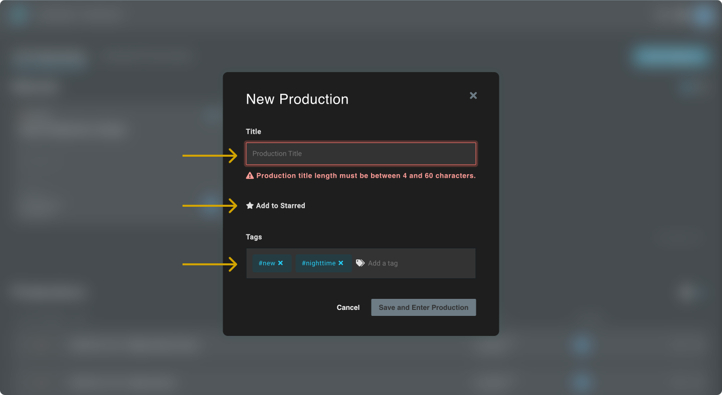
Streamlining Production Creation
- →Adding a modal to the workflow prompting user to add a name for the new production.
- →If users do not belong to a team, remove option.
- →The option to “Add to Starred” directly within the creation process.
- →A tag feature for categorizing the production to facilitate searching and organization.
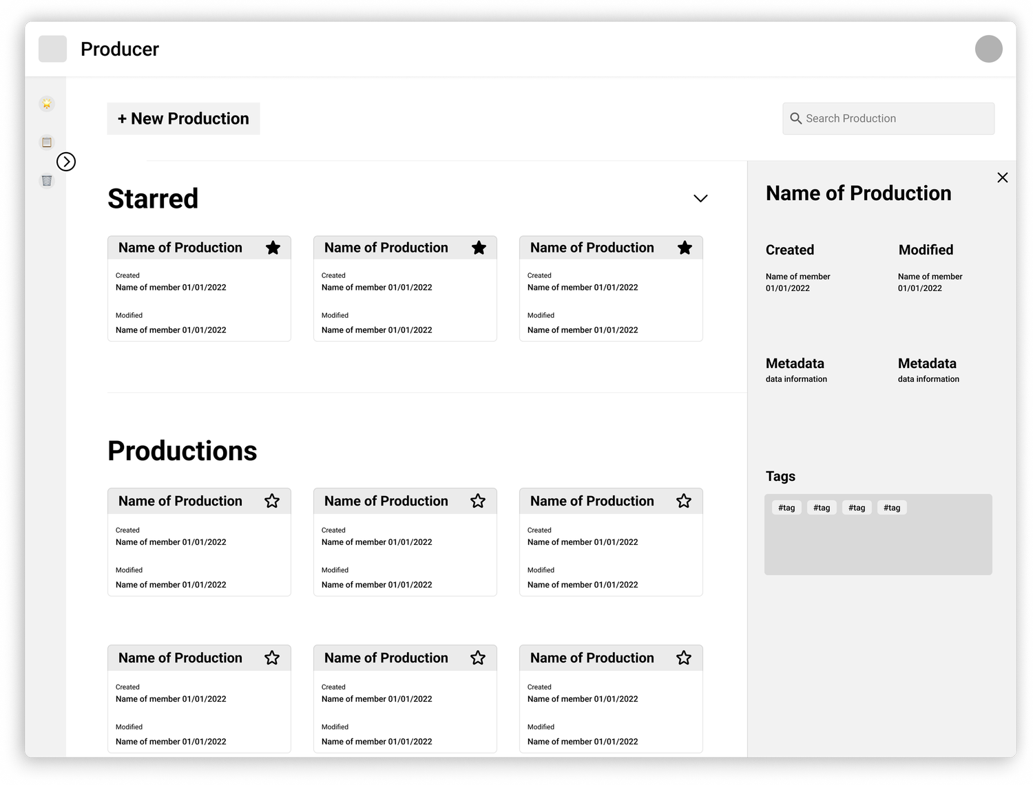
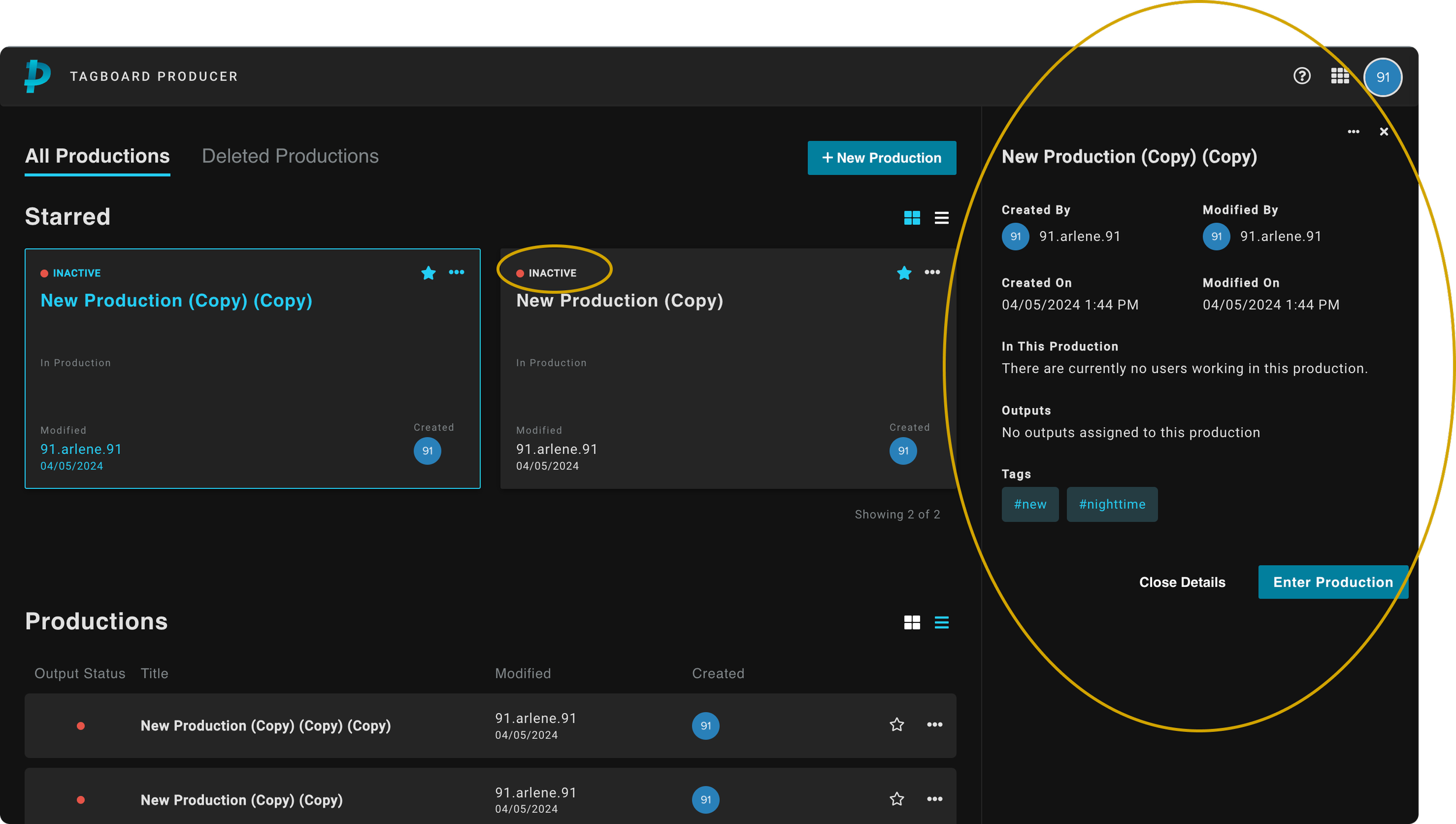
Enhancing Information Display
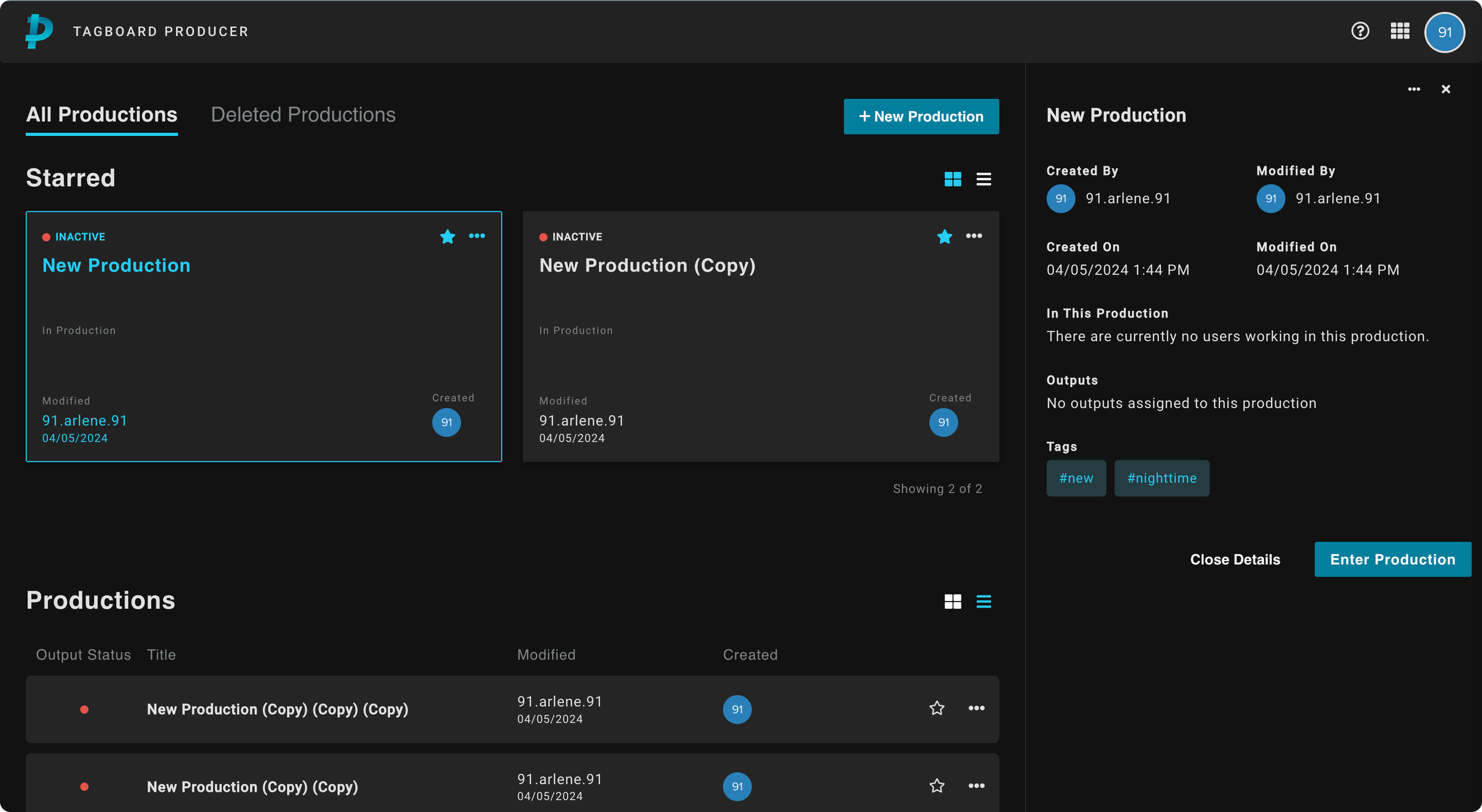
- →Upon single click: A right panel opens to display important meta data for each item to help with creation and edit history.
- →Output status to let users know which production is “Live” and “On-Air” so they do not enter during air time.
- →A view in to who is working inside a production.
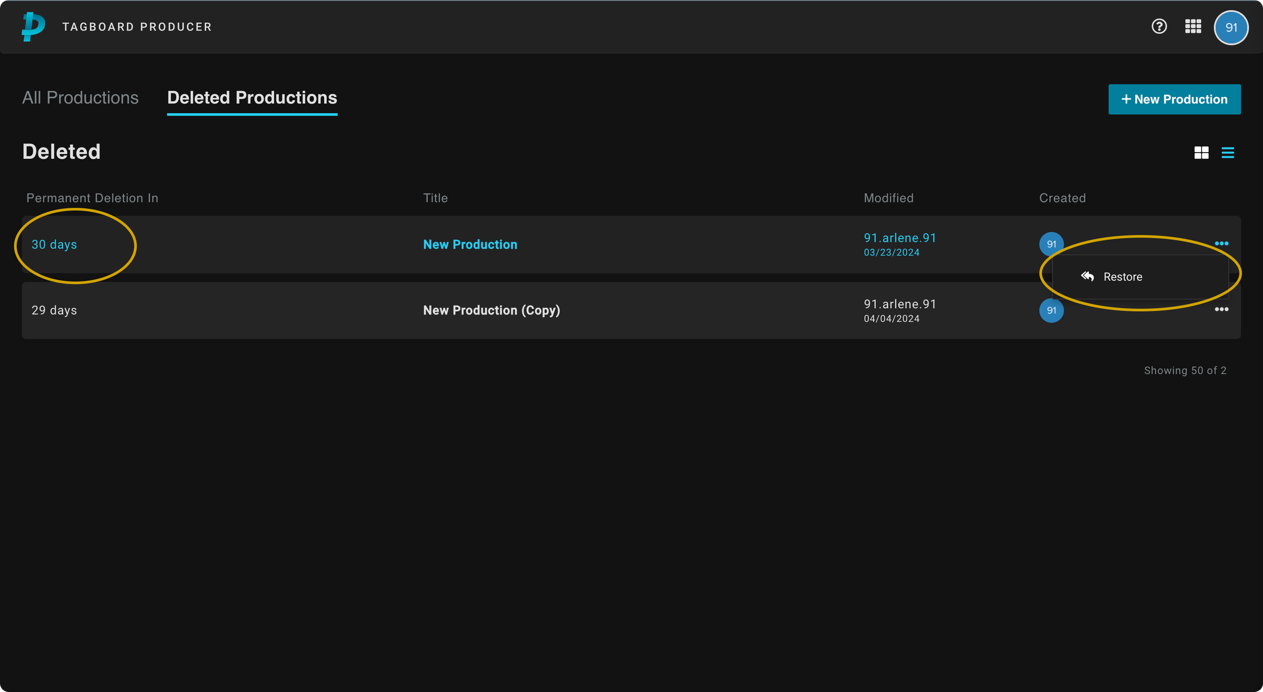
Improving Production Management
- →Option to delete productions to keep unused or old productions out of view.
- →Restore feature with 30 day notice for accidental deletions and better management.
Shipped
Results
Impact post release
Rise in users generating unique and specific production names
Increase in production discovery speed
Reflection
Challenges & final thoughts
What happened to a search bar?
Due to the timeline of the project, we were unable to add a search engine to the MVP. Although starring productions helped sort important productions, it does not help when there is a long list of productions. Search would've been a complete net new feature that require extensive research that time did not allow.
Tagging was unsuccessful
Introducing a new workflow in the dashboard showed to be unsuccessful. If I had the time, I would've conducted user testing to validate our assumption that tagging would be widely used. Without a search feature, it served little to no purpose to users.
Feature prioritization
If I were to have done this project over I would've prioritized a search function over adding a tagging feature for the Dashboard. In retrospect, it makes sense why adding a search over a tagging feature would be beneficial; it is a workflow users were already accustomed to. In contrast, tagging a production was a new feature, so users naturally didn't seem convinced by it.
- ·The existing dashboard had years of feature accumulation; every element had a stakeholder. Navigating that required diplomacy as much as design judgment.
- ·Shipping incrementally rather than all at once meant designs had to be backward-compatible with existing workflows.
- ·Constraints forced creative prioritization: deciding what not to show was often harder than deciding what to show.
- ·Observing real producers in live broadcast environments revealed pain points no survey would have surfaced.
- ·Information architecture work is invisible when done well; users just feel like the tool 'makes sense.'
- ·Bringing engineers into discovery sessions early shortened the feedback loop and prevented costly design pivots late in the process.
- ·Clarity over cleverness: in high-stakes live environments, producers need confidence, not novelty.
- ·Every extra click in a live production is a liability. Speed and predictability are features.
- ·A great dashboard disappears: the producer's focus should be on the show, not on navigating software.