Tagboard • Data Integration • UX • Automation
Google SheetIntegrationTagboard Inc. · 2023
Introducing Google Sheets to the Graphic Editor, automating live data importation and streamlining the on-air workflow for graphic Creators.
Due to Non-Disclosure Agreements, specific details and visuals from this project are omitted to maintain confidentiality.
Context
The Project
Role
Lead Product Designer
Company
Tagboard Inc.
Year
2023
Scope
Feature Design, End-to-End
Tagboard's Graphic Editor is the creative tool used by content producers in sports, news, and entertainment to design and publish live graphics. As the platform grew, a consistent user request emerged: connect graphics directly to live data sources, so content could update automatically without manual intervention.
I led the end-to-end design for the Google Sheets integration, from mapping user flows and conducting competitive analysis through final design handoff. The goal was to make data-driven graphics feel approachable for every user, regardless of their technical background.
Credits: Lance Harper, Justin Brumley, Griffin Hammer (Engineering), Jenny Yang (Product Manager).
The Problem
What We Were Solving
“Users had to manually import live data into their graphics, a process that was time-consuming, error-prone, and completely disconnected from their actual data source.”
Goals
What We Were After
Business Goal
Expand Tagboard's data integration capabilities to support live, dynamic content creation, enabling producers to connect their existing Google Sheets workflows directly to on-air graphics without manual data re-entry or technical overhead.
My Plan
Map the full integration flow from the user's perspective, identify where technical complexity created friction, and design a UI that made data connection feel as natural as editing text, with progressive disclosure for advanced options.
Discovery
Understandingthe bigger picture
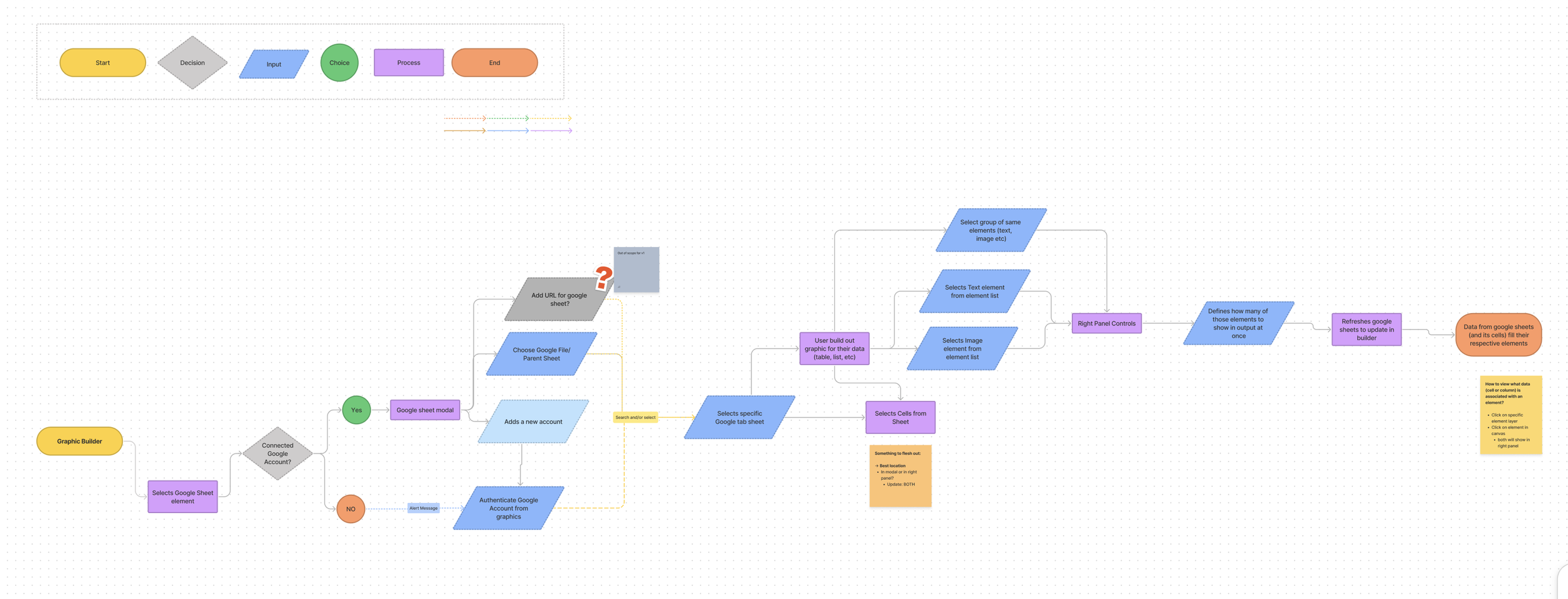
Before designing anything, I created high-level user flows to understand how users would interact with the integration end-to-end, identifying MVP features and surfacing knowledge gaps between design and engineering.
Essential Requirements
Support both private and public Google Sheets, offering flexibility for different team security models and use cases.
Enable background auto-synchronization so graphics stay live without producers manually refreshing during a broadcast.
Allow users to map data to specific graphic elements, with control over format, appearance, and behavior per element.
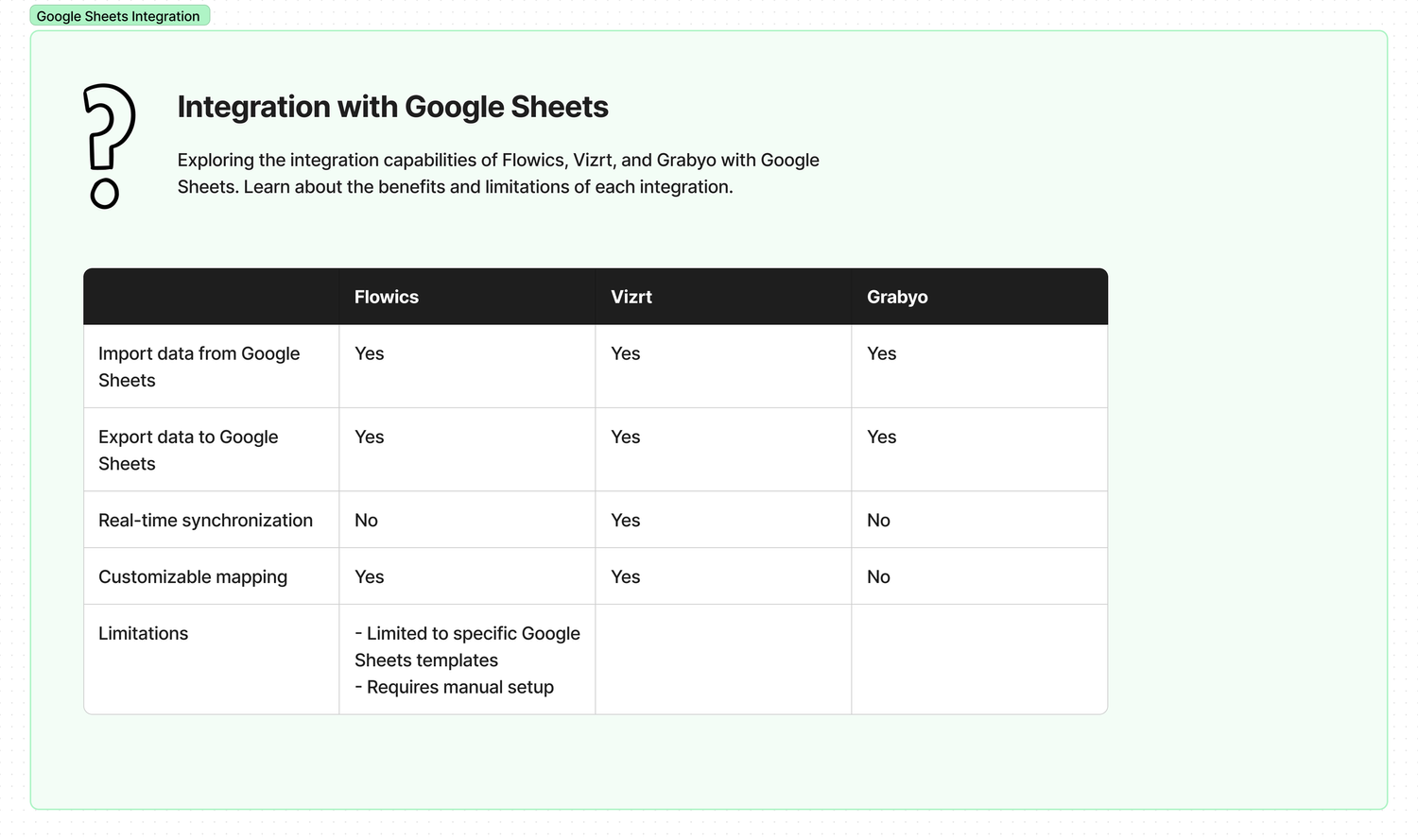
Research
User Pain Points
Through user flows, competitive analysis, and direct conversations with graphic Creators, three core friction points emerged that shaped the entire design direction.
Manual Data Entry Errors
- ·Users had to copy-paste live data from spreadsheets into Tagboard graphics by hand, a slow, error-prone process under broadcast deadlines.
- ·Any update to source data required repeating the manual process entirely, with no way to stay in sync automatically.
Intimidating Technical Workflow
- ·Data-specific jargon ("pagination", "cell references", "data binding") created a steep learning curve for non-technical graphic Creators.
- ·Users weren't confident which data points were available or how they mapped to elements in their graphic.
No Live Synchronization
- ·Graphics went stale the moment source data changed; producers had to manually refresh, creating risk of airing outdated information.
- ·There was no background sync, so users had to stay vigilant and manually trigger updates throughout a live broadcast.
The Solution
Design Decisions
Two core design challenges defined the work: making a technically complex workflow feel simple, and making data-driven content creation accessible to non-technical graphic Creators.
We solved these by:
Simplification of Complex Workflows
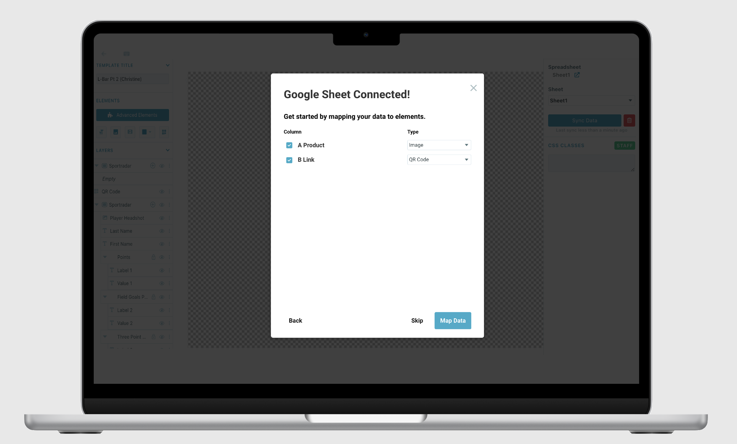
- →Display all Google Sheet cell data upfront rather than listing column headers only, giving users full confidence in what they're importing.
- →Allow importing data directly onto the canvas. Tagboard auto-defines elements as text or image, reducing decision fatigue.
- →Alternative workflow: add a text or image element first, then map data to it, supporting both beginner and power-user patterns.
Democratizing Data-Driven Content
- →Replaced data-specific jargon with plain language: "current page" instead of "pagination", lowering the barrier for non-technical graphic Creators.
- →Auto-display data formatting that matches how it appears in Google Sheets, so users immediately recognize their own data.
- →Reduced modal usage to prevent workflow interruption; right-panel options handle filtering, layout, and spacing adjustments inline.
Key Insights
Refining Success Through
Feedback and Testing
The quality of this feature came from three core practices: continuous design critiques, extensive user testing, and disciplined feedback loops. This approach created a dynamic, user-focused development environment, allowing us to iteratively enhance the product based on real-world usage and feedback before every release milestone.
Design Critiques
Regular cross-functional critique sessions caught edge cases and UX regressions early, before they reached prototyping or testing.
User Testing
Usability tests with real graphic Creators revealed that terminology was the #1 barrier, leading to the plain-language redesign of all data labels.
Feedback Loops
Structured feedback collection after each testing round created clear prioritization signals and kept the engineering team aligned on what to build next.
- ·Leading a complex API integration taught me how to bridge engineering constraints and user expectations. I had to deeply understand what the Google Sheets API could and couldn't do before designing around it.
- ·Working at the intersection of technical capability and non-technical users pushed me to become a stronger advocate for plain-language design.
- ·Regular design critiques and feedback loops across engineering, PM, and users made me more rigorous about validating assumptions before finalizing any pattern.
- ·Showing all data upfront, rather than asking users to trust the system, was the single biggest confidence builder. Transparency in data selection is a UX principle I'll carry forward.
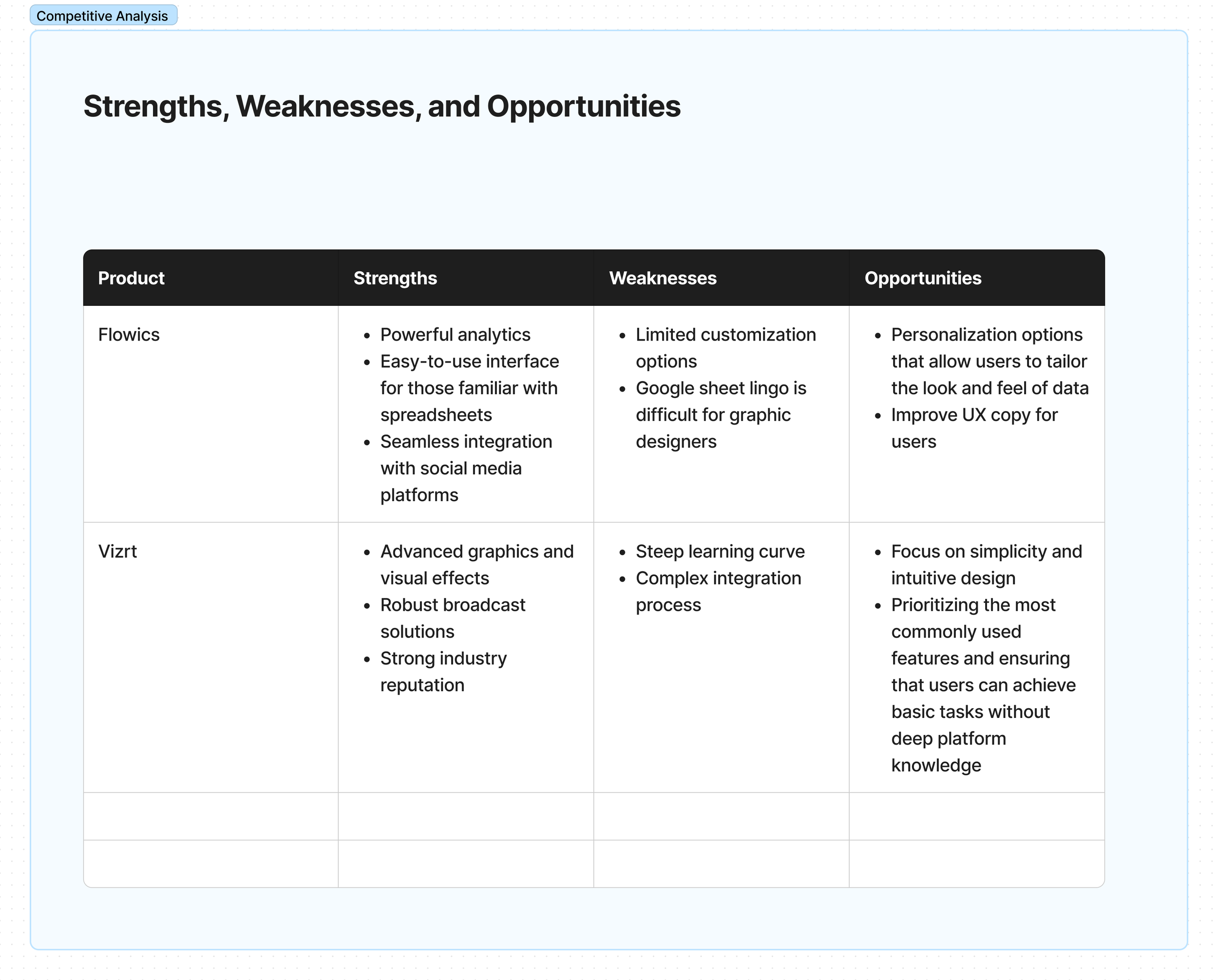
- ·Competitive analysis revealed that most tools make the same mistake: designing for data engineers, not for the people who actually use the data in context.
- ·Feedback loops matter most on ambiguous features. We caught two critical misalignments in usability testing that would have shipped as confusing UI without it.
- ·I would have pushed harder for an onboarding flow for first-time connection. Users who'd never used a data integration before needed more scaffolding than we provided at launch.
- ·The mapping interface still felt technical to some users. I'd explore a more visual drag-to-map interaction as an alternative to the dropdown-based approach.
- ·Earlier workshops with Customer Success would have surfaced edge cases (private sheets, permission errors) that we only discovered late in testing.